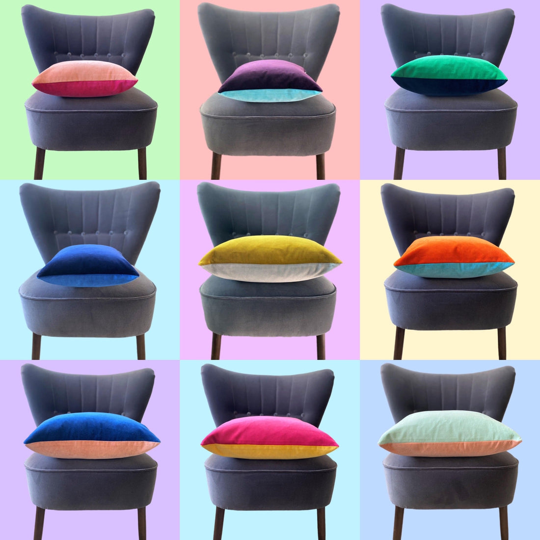
luxury velvet cushions uk

2025 Is The Year To Colour Your Home Happy

There are many many positive benefits to living in a home filled with colour and a lot of consensus about the significant impact colours have on our lives.  I know many people are reticent about introducing colours into their homes, especially after so many years when grey has ruled the interiors world, but with the many shades in the garden beginning to fade, now is the time of year to give colour a go....


My approach to choosing colours and furnishings for the home is to try not to be overly influenced by fashions and fads and to focus instead on the colours which my family and I genuinely love and will want to live with for years to come. 

There is so much waste involved in constantly updating our homes to keep up with the whims of fashion, and so much on the high street is cheap and disposable but sadly not degradable.  With all the detritus washing up on beaches it is definitely time to start thinking longer term and buying fewer, higher quality items which will last for years.  So it is worth putting time and thought into choosing colours you love and won't tire of.

Kate Watson-Smyth, the award winning interiors journalist and writer advises in her Sunday Times article 'Colouring Book' that 'the best place to start when choosing a colour is your wardrobe, because if you're comfortable wearing it, you'll be comfortable living with it.' 

I agree with this but also think decorating your home is a great opportunity to introduce the colours you love but frankly look ghastly in!  For me and my yellowy skin, anything with a yellow undertone looks hideous on me, yet I love yellows, pale pinks and greens.  I take every opportunity to pop these colours into the house with the introduction of cushions.

Yellow:

Leatrice Eiseman, colour specialist and executive director of the Pantone Colour Institute has conducted color word association studies on thousands of people over the past 30 years. The first words that consistently come to mind when people see the color yellow are "sunshine," "warmth," "cheer," "happiness"
Yellow's mood-improving traits have even been used to help seasonal affective disorder, a type of depression that occurs each year during autumn and winter, believed to be influenced by lack of sunlight, or the colour yellow.
This could be just the time of year to introduce pops of yellow into your home to banish those winter blues.
Pink:
Pink is the color of warmth and happiness.  Brighter pinks are youthful, fun, and exciting, while vibrant pinks have the same high energy as red.
Lighter pinks have been found to have calming qualities. A number of prisons in Switzerland and the United States are painted pink. In 2013, it was reported that when a Swiss prison painted about 30 cells pink, anger levels were reduced within 15 minutes.
The gender association of pink is complex and ever changing. In the late 19th and early 20th century pink was actually the colour for boys.  I look back fondly on the early years of my eldest son when his favourite colour was very much pink (before a little boy at nursery clearly told him the 'rule' that pink was a girl's colour and he sadly changed his favourite colour to blue that very day!)
For years I shied away from pink probably because of its' 'girly' connotations, but now I have introduced it into my home I will never be without it again.
Orange:
Orange is the colour of comfort and confidence. "It combines the energy of red and the happiness of yellow," said Sara Petitt, a member of the faculty of fabric styling at the Fashion Institute of Technology in New York.
As Kate Watson-Smyth says, orange is, 'the colour of companionship and laughter, apetite and intelligence, orange is the feelgood shade: happy, social and extrovert.....we should worry less and experiment more when choosing hues'.
Green:
Humans are trichromats, meaning we perceive three primary colors: blue, green and red. In the middle of the spectrum resides green.This wavelength is where our perception is at its best -- and keeps us healthy. Green is a colour of balance, restfulness and calm.  It is supposed to relax our retinas and calm our nerves.
Green is also the colour of nature and as the colours fade in the garden at this time of year it is a great time to introduce greens into the home through soft furnishings and also house plants. A favourite colour combo of mine is to contrast greens and pinks.  If it works in nature, then it works indoors too.
Blue:
As Kate Watson-Smyth tells us, 'Blue is the world's favourite colour. Time after time in surveys, this restful shade takes the top spot'.
The versatility of blue is incredible.  All shades of blue work with each other and more than that, blue is the one colour which I think goes with every other colour.  I'm not sure who arrived at the phrase that 'blue and green should never be seen', but whoever it was had clearly never opened their eyes on a brilliant blue skied day in the countryside.
In summary, there is no right and wrong when choosing colours for your own home. If you love the colours and they make you happy then in the words of one of my very good friends 'Go For It'. The only thing I think you can do wrong is be led away from your happy colours by the whims of fashion. 
Back to blog

Leave a comment

Please note, comments need to be approved before they are published.